|

|
|

|
Be Creative with LegendsMapPoint's default legends are a great place to start. But a little work in modifying them can make your point stronger, and the lessons you learn richer.
April 5, 1999 - When you create a thematic map in MapPoint 2000, the program helpfully supplies default data breaks for whatever type of analysis you'ved specified. The program also creates a default title for the legend, and descriptions for each of the "bins" (area shades, colored or sized circles). Unless you're just getting a quick handle on some data for yourself, you'll almost always want to change each of these. These changes can sharpen your analysis, as well as strengthen the point your map makes. We used MapPoint, and its included county level data on people with graduate degrees, to create a thematic map for the contiguous 48 states, shading by county. Looking first at those counties with the "most" of these people, we get the following map:
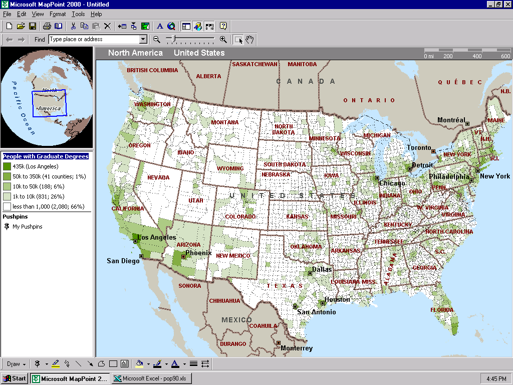 Note that we've adjusted the bins so that most of the country falls in one bin. This would be appropriate in the case where we want to target the population, caring more about "where they are" than "where they aren't." So we fiddled with the class breaks until we got down to only one county in the top bin; and similar small participation in the other three bins. We supplied a new, more compact title. And we rewrote the legend. Our legend, in very compact form, now tells the number of people with graduate degrees for each color, the number of counties in each bin, and the percent of counties that bin represents. Suppose we care more about the density of people with graduate degrees than their absolute number. We use MapPoint's "Compare the data" option to map the ratio of people with graduate degrees to the total population. In that event, we get quite different results:
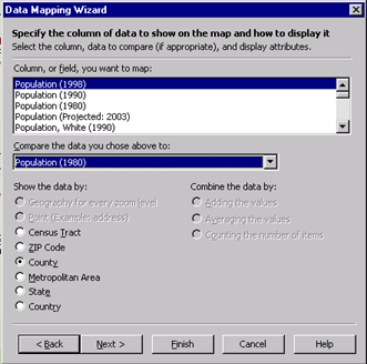
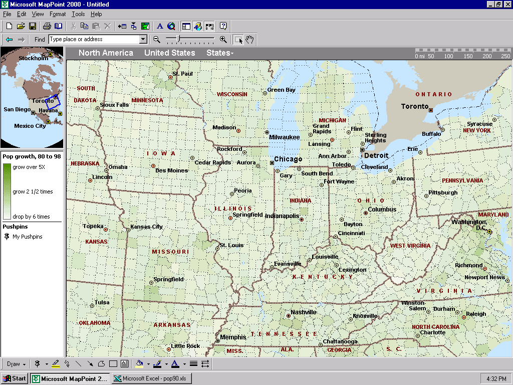
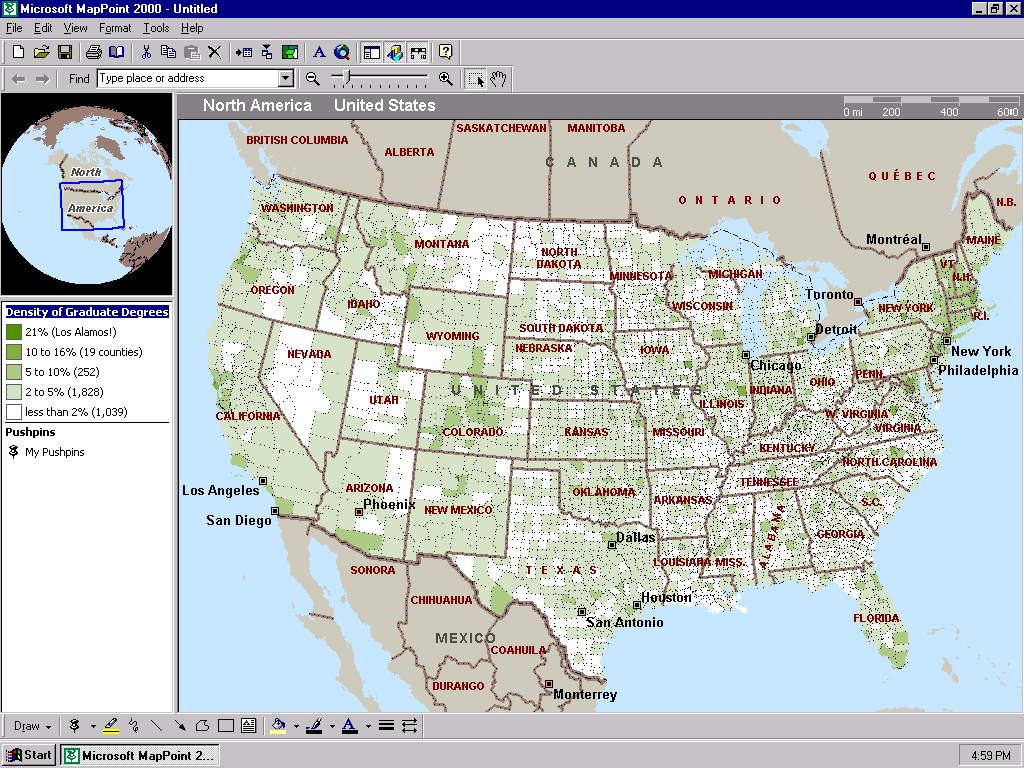 Once again, we've replaced the title of the map, and customized the legend so that it conveys a maximum of information. Did Los Alamos surprise you? You can use the "compare to data" option to show the rate of change of a variable as well. Here's the dialog box to develop a map to show population growth and decline from 1980 to 1998:
 And here's the resulting map, zoomed to the midwest:
 Editing class break bins and legends is a powerful way to both learn more, and teach more, from your data.
 Author: Scott Elliott Author: Scott ElliottEmail: scott.elliott(AT)directionsmag.com URL: http://www.directionsmag.com Scott Elliott enjoys Amis, Ellison, Ford, Hardy, Percy, Tolstoy, Turgenev and some living writers. He is Publisher of Directions and MP2K magazines.
|
|
||||||||||||||||||||||||||||||||||||||||||||||||||||||||||||||||||
|
|
||||||||||||||||||||||||||||||||||||||||||||||||||||||||||||||||||||